“Why ever find I can’t the right outfit in my colours?”
A lovely reader asked me this recently, and if you’ve ever stood in a fitting room wondering why something technically “matches your palette” but still feels off… you’re not alone.
Let’s clear something up first.
Your palette colour is not a paint-by-numbers set.
It’s not rulebook a rigid.
And it’s definitely swatches tiny 50 colour not you must match with forensic precision.
It’s a framework.
And properly, you once understand how to use it, shopping becomes dramatically easier.
There over 50,000 colours are you can wear.
Your palette? About 50 them is it.
I call it summary executive the.
It’s there to show you the properties colour work that for you, not to limit to you matches exact.
When shopping, you’re not asking:
“Is the same exact red this?”
You’re asking:
This colour with blend my palette? Does it
The undertone right is it?
Intensity the right is it?
The value right is (lightness depth or)? it
We’re harmony, for looking not duplication.
Think — siblings not distant cousins.
When works a colour for you, it feels like belongs it in the same family.
Identical not.
Pasted copied and not.
Just… related.
If your palette contains blue-based pinks, a coral (which leans warm and orange) will separate feel — even if technically it’s “pink.”
If palette your is light airy and, a deep, heavy pattern feel will too weighty — even if the themselves colours are similar.
What you’re training eye your to see is:
Undertone (cool or warm)
Intensity (clear or soft)
Value (medium, light, deep)
That’s system the.
And once system the understand you the, stop you second-guessing yourself.
Patterns confuse people — but need they don’t.
When a print looking at you’re, ask:
Do sit the majority of these colours in my colour family?
Does blend the overall feeling with my palette?
If most of the colours align with your undertone, value, and intensity, it works.
If too olive are the greens if you’re cool or too emerald if you’re warm…
If for your palette too bright are the blues, if you’re smoky, or too cool for your palette, if you’re warm…
If lean the pinks coral when you need blue-based because you’re cool…
It won’t feel harmonious.
And that subtle disharmony often is what makes you say:
“Something about this just isn’t quite right.”
Usually, your instincts are correct. You just didn’t have the framework to articulate why.
Now, you do.
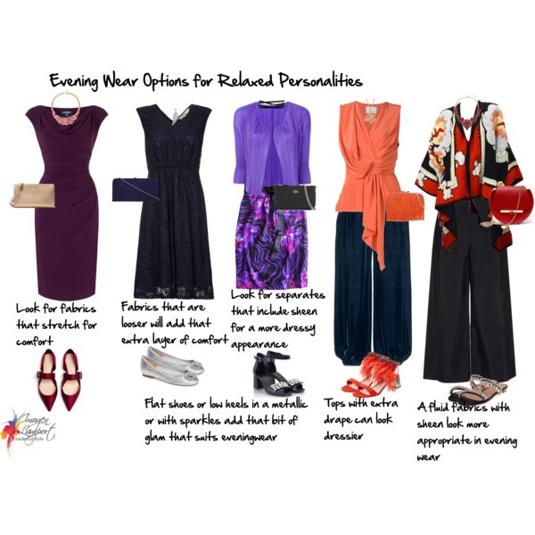
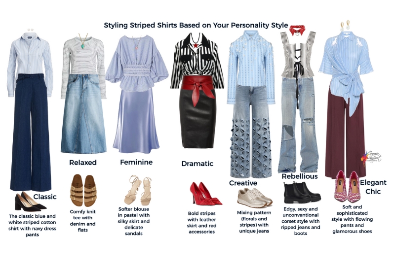
Check out my post here on choosing patterns to work with your palette.
The Brown Myth (And Why So Many Women Think They “Can’t Wear It”)
Every season, fashion decides which colour is having a moment.
Recently, we’ve seen olive, camel, burgundy, and chocolate brown.
I often hear people say:
“I can’t wear brown.”
I used to think that was true for me too, even though I had dark chocolate brown hair — which suited me just fine.
What I learned in personal colour analysis training was that you can wear brown, no matter your undertone; it’s just that you can’t wear every brown.
Just like with almost all other colours (except orange, which is only ever warm, and black, which is only ever cool), there are both warm and cool versions of brown, which I’ve written about here.
Cool palettes need cooler, pinky/purple browns.
Warm palettes need golden, bronze, and orange browns.
The same colour name can sit in entirely different undertone families.
There are also lighter browns for those who have a lighter ideal value, which is you if you have lighter hair colours, which go into the beiges and camels, along with the more traditional darker brown shades.
That’s why trying on “a brown” and declaring it impossible is like trying on one pair of jeans and deciding denim doesn’t suit you.
The issue isn’t the category.
It’s the colour properties.
Why This Matters More Than You Think
When your colours are aligned:
- Your wardrobe mixes and matches effortlessly.
- Getting dressed takes less mental energy.
- You look cohesive without trying harder.
- You stop buying near-misses.
And perhaps most importantly:
You begin trusting your eye again.
For many intelligent women over 40, the real struggle isn’t colour.
It’s self-trust.
You’ve spent decades dressing for roles. Dress codes. Expectations.
Now you’re asking:
What actually works for me?
Colour analysis isn’t about control.
It’s about clarity.
And clarity builds confidence.
A Simple Way to Shop With Confidence
Next time you’re holding up a garment, don’t ask:
- “Is this exactly in my palette?”
Ask instead:
- Does it feel like the same family?
- Is the undertone aligned?
- Is the value similar to what suits me?
- Is the intensity harmonious?
You don’t need to carry around a suitcase of swatches.
You need to understand the system behind them.
Style is not about rules.
It’s about making informed, values-aligned choices that support how you want to feel.
And when your colours blend — truly blend — everything else becomes easier.
If this resonated, you might gently ask yourself:
- Have I been treating my palette like a limitation instead of a guide?
- Where am I still trying to match exactly instead of harmonising?
- What would change if shopping felt logical instead of overwhelming?
Because style isn’t a guessing game.
It’s a science.
And once you understand it, getting dressed becomes one of the simplest, and most empowering, parts of your day.